← Back to projects

UX/UI & Content Strategy · Himalayan Bone Broth · 2024

When trust is the product.

A user-centered design blueprint for Himalayan Bone Broth's e-commerce platform — introducing a traditionally inspired product to health-conscious, skeptical shoppers through honest information, clear navigation, and an experience that reflects the brand's values of purity and reliability.
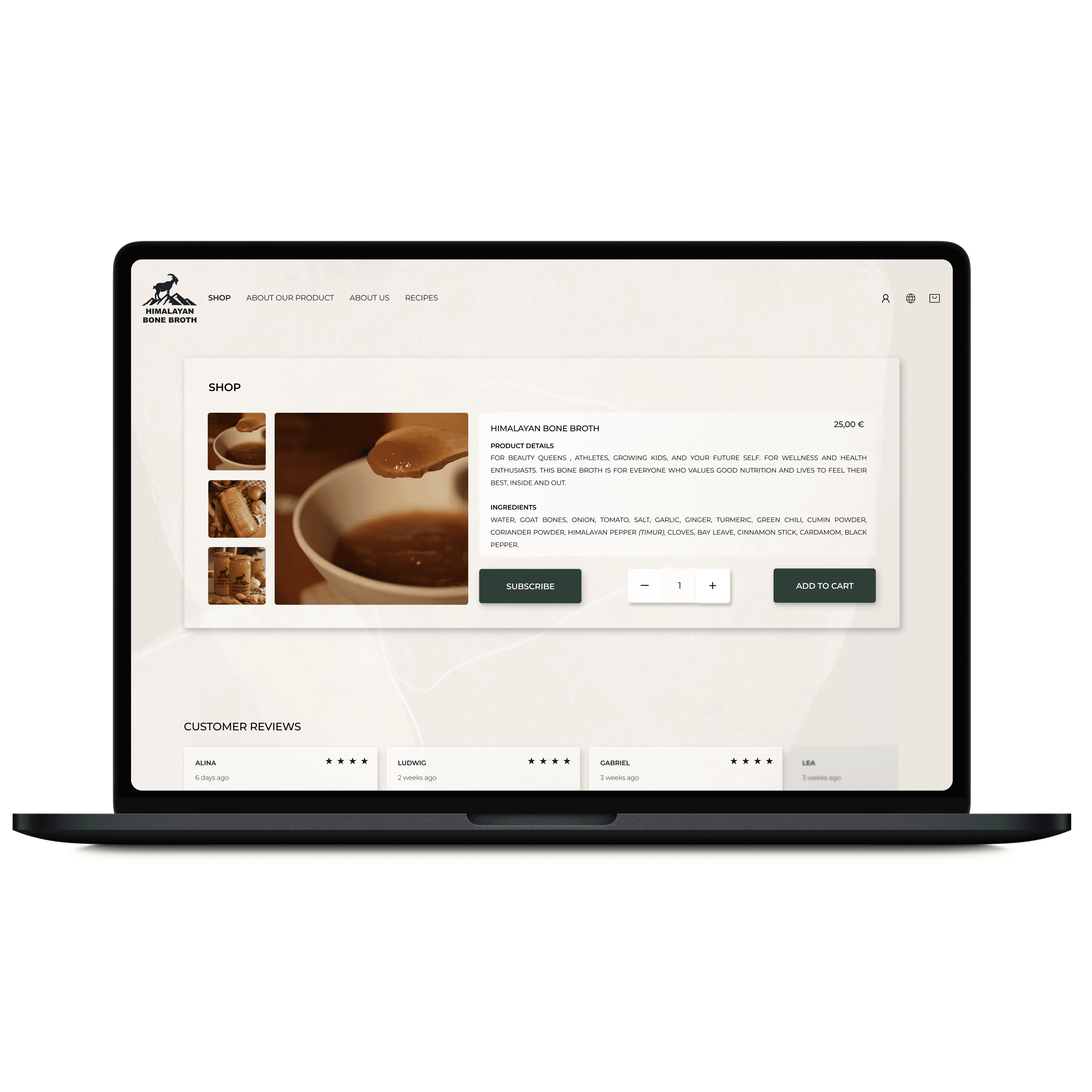
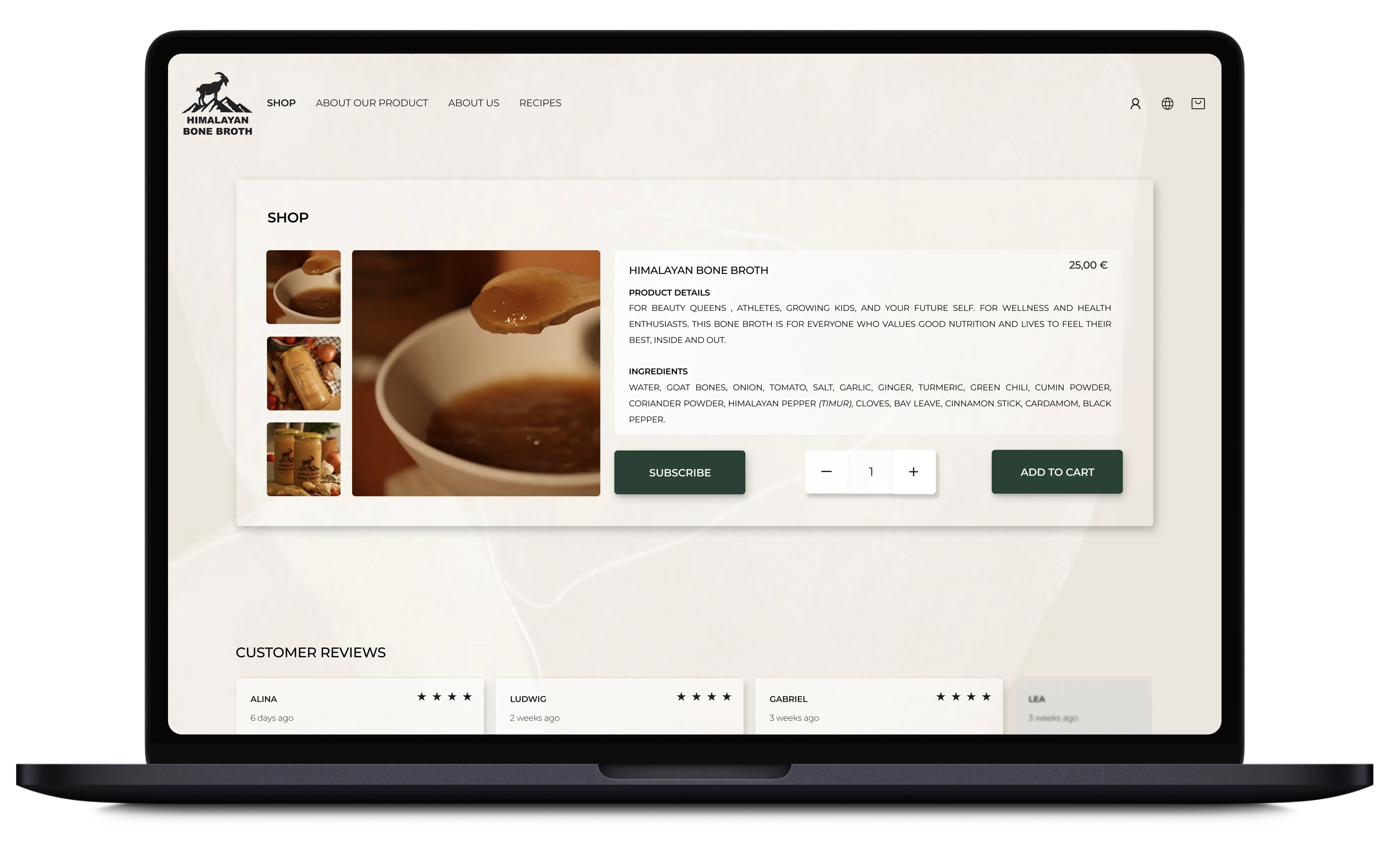
Laptop mockup of the Himalayan Bone Broth product page.
Industry
Wellness Nutrition
Client
Himalayan Bone Broth
Year
2024
Role
UX/UI Design & Content Strategy
Timeline
5 weeks · Part-time · Team project
Himalayan Bone Broth product page shown on a laptop mockup.

The challenge

Trust as currency

Many health-conscious consumers are skeptical: confusing marketing, vague claims, and unclear sourcing leave them unsure what they're actually putting into their bodies. The task was to design a site that felt honest, clear, and trustworthy from the first glance — because when trust is the product, small UX choices matter a lot.

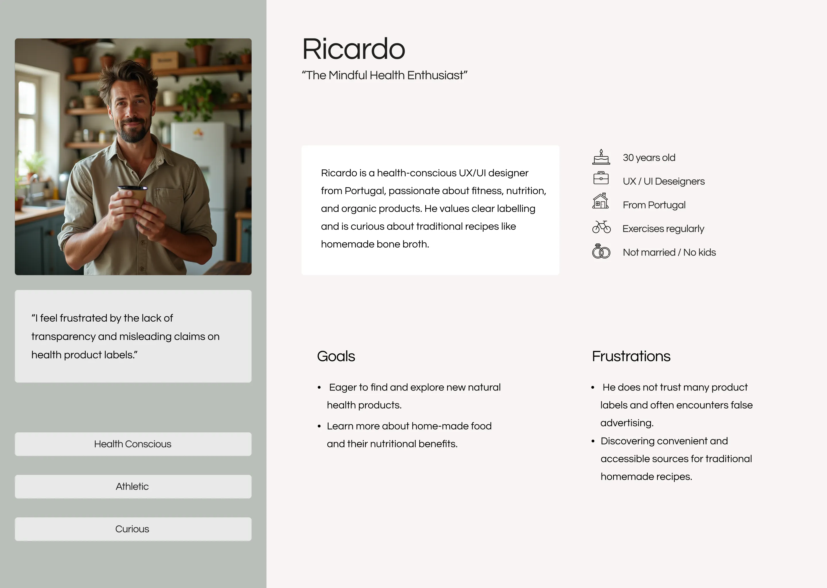
Persona card for Ricardo, a wellness-oriented shopper.

Who we designed for

Meet Ricardo

We interviewed people with healthy lifestyles and wellness-oriented values from different backgrounds and geographies — all sharing a demand for transparency around ingredients, sourcing, and health claims. From them we built the persona Ricardo and mapped his journey from discovering the product to making a confident purchase.

How can we design a site that feels honest, clear, and trustworthy — from the very first glance?
The project's guiding question
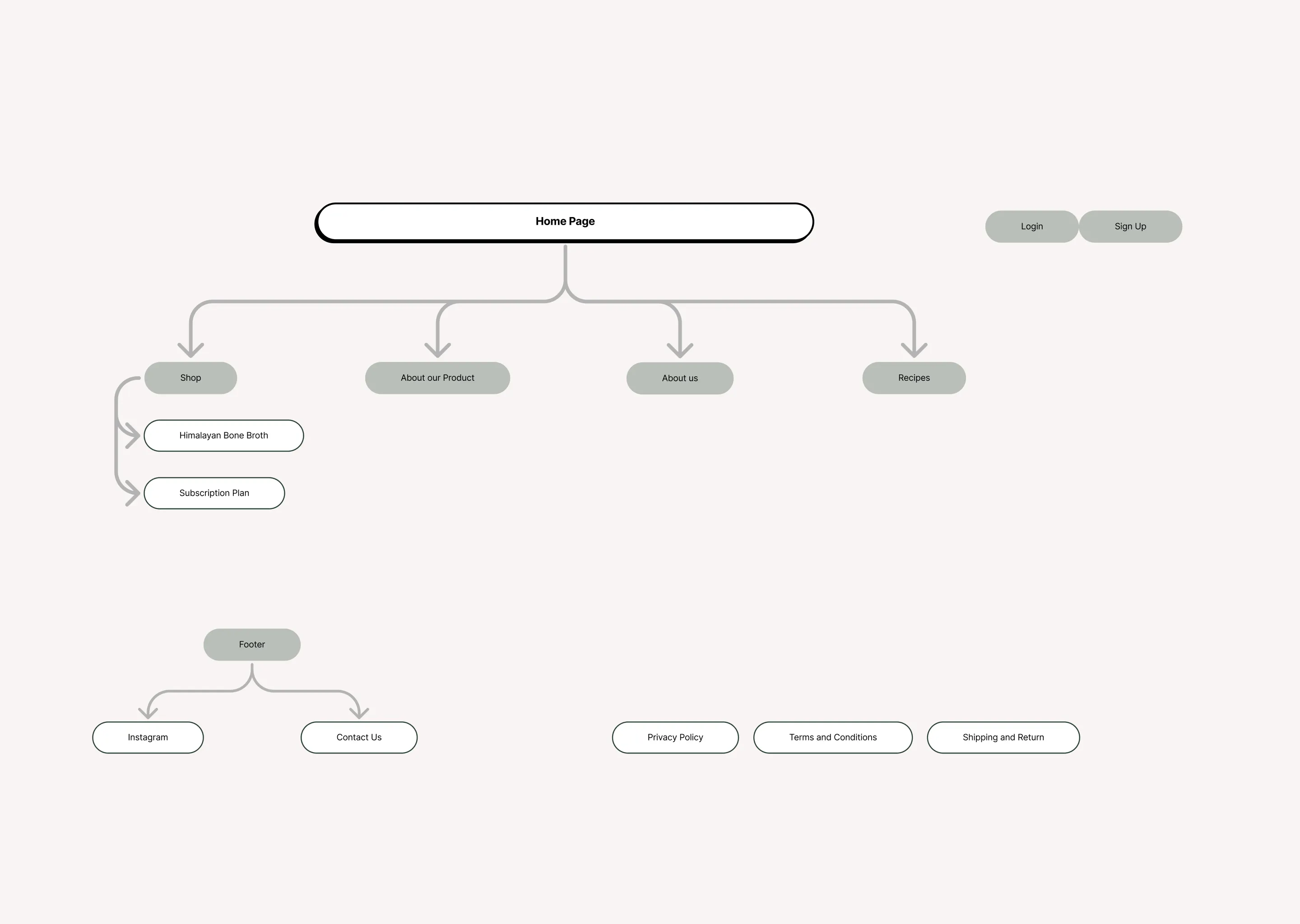
User flow diagram from browsing to purchase.Sitemap diagram for the Himalayan Bone Broth website.

Solution

Designing for honesty

  • A clear sitemap — content organized logically, avoiding clutter or misleading category names.
  • Guided user flows — leading from browsing to purchase without overwhelming, giving users time to digest.
  • Honest UX writing — straightforward ingredient and benefit descriptions, with no misleading claims.
  • A clean aesthetic — readability first, reducing cognitive load so users feel grounded rather than overwhelmed.
Low-fidelity wireframes for the Himalayan Bone Broth site.Mid-fidelity screens for the Himalayan Bone Broth site.

Testing

What users told us

  • Open and clear — testers described the site as honest and easy to trust.
  • Everything within reach — they appreciated easy access to all the relevant information.
  • A straightforward path — a clear route from browsing to a confident purchase.
  • Inform, don't push — the design empowers users to decide independently, respecting their skepticism and valuing their need for clarity.
More projects Show all
Copied to clipboard