← Back to projects

UX Research & Accessibility · ILGA Portugal · 2025

Navigating shouldn't feel like solving a puzzle.

A six-week redesign of ILGA Portugal's website so anyone seeking information, events, or help could find it quickly and confidently — a digital home that serves a marginalized community with clarity, warmth, and care.
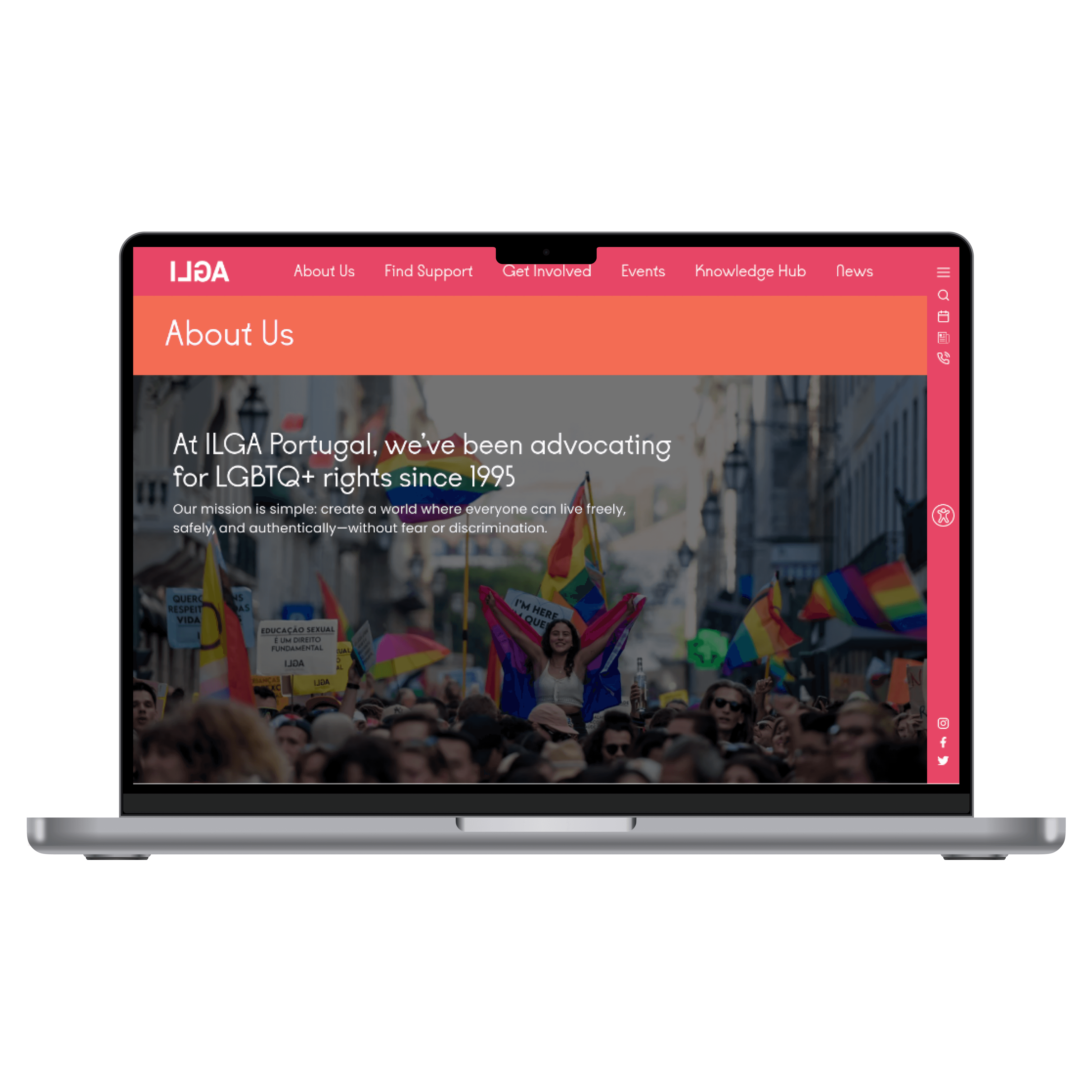
Laptop mockup showing the redesigned ILGA Portugal About Us page.
Industry
Non-profit civil society (NGO)
Client
ILGA Portugal
Year
2025
Role
UX/UI & Accessibility Design
Timeline
6 weeks · Part-time · Solo project
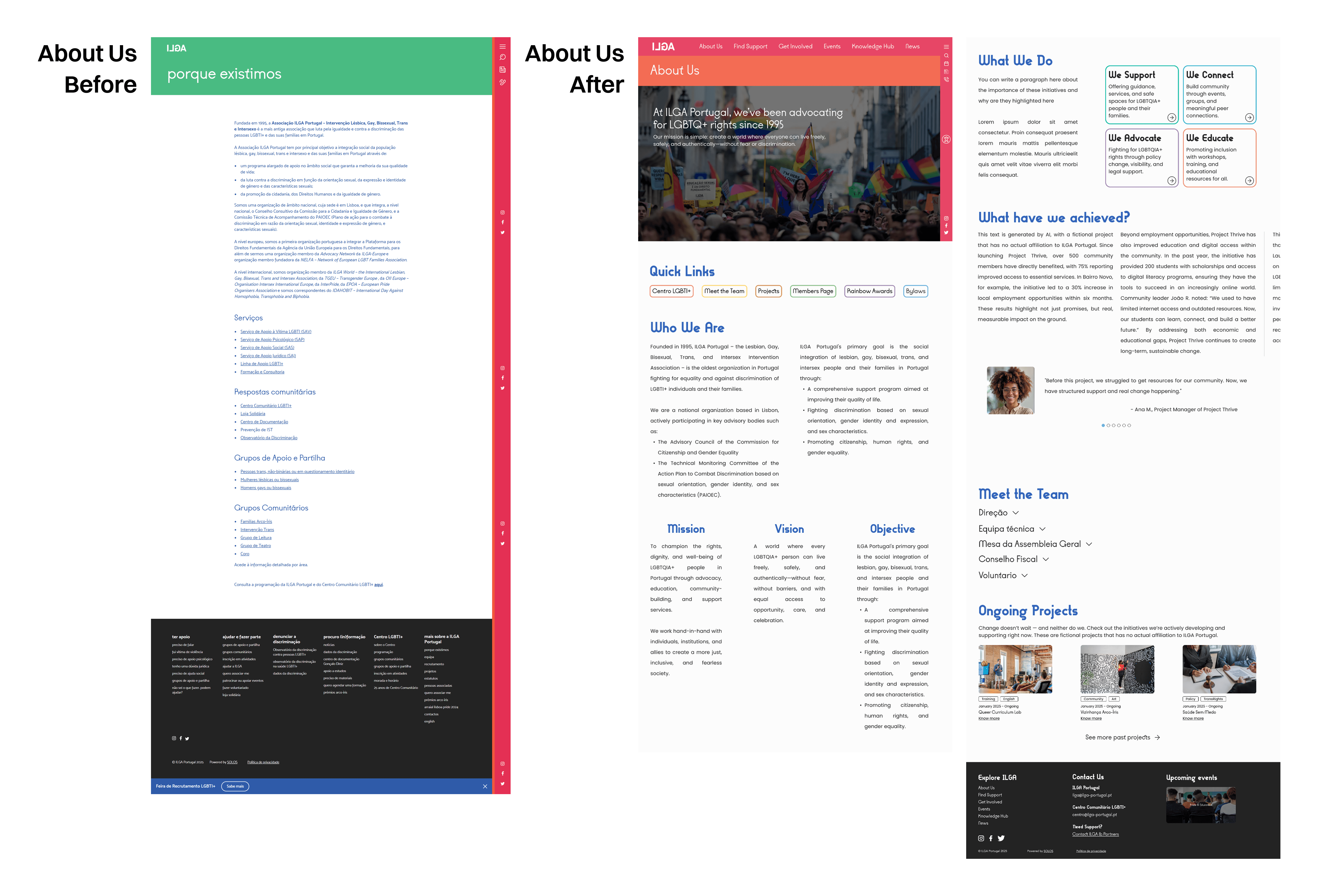
Before-and-after comparison of the ILGA Portugal About Us page.

The organization

Portugal's leading LGBTQIA+ advocate since 1995

ILGA Portugal is built on three pillars — political advocacy, support services, and community empowerment. Yet usability testing showed that many first-time visitors couldn't grasp that mission within seconds of landing on the homepage. The work it exists to do was buried beneath internal terminology.

Side-by-side comparison of the original and redesigned ILGA Portugal homepage.

The approach

Six weeks, research to hi-fi — solo

Working alone, I led the full process: stakeholder interviews, competitive benchmarking of five NGOs, accessibility research against WCAG, and two rounds of usability testing — carrying the redesign from early findings through to a high-fidelity prototype.

Before-and-after views of the ILGA Portugal site navigation.Comparison of the original and redesigned ILGA Portugal events page.

Challenge

Where first-time users got lost

  • 67% had never heard of ILGA — first-time visitors were the rule, not the exception.
  • 50% misread the homepage — as an employment agency rather than an advocacy organization.
  • 83% struggled to find events — there was no clearly labeled “Events” section.
  • Confusing labels — “Activities,” “Projects,” and “Programs” blurred into one another.
  • Scattered resources — spread across unclear categories with no central hub.
  • Accessibility gaps — limited color contrast and no font resizing.
Many people don't immediately understand what ILGA does. Our critical work is buried, and users rely on Google to find our own pages.
ILGA stakeholder
Stakeholder interview · ILGA Portugal
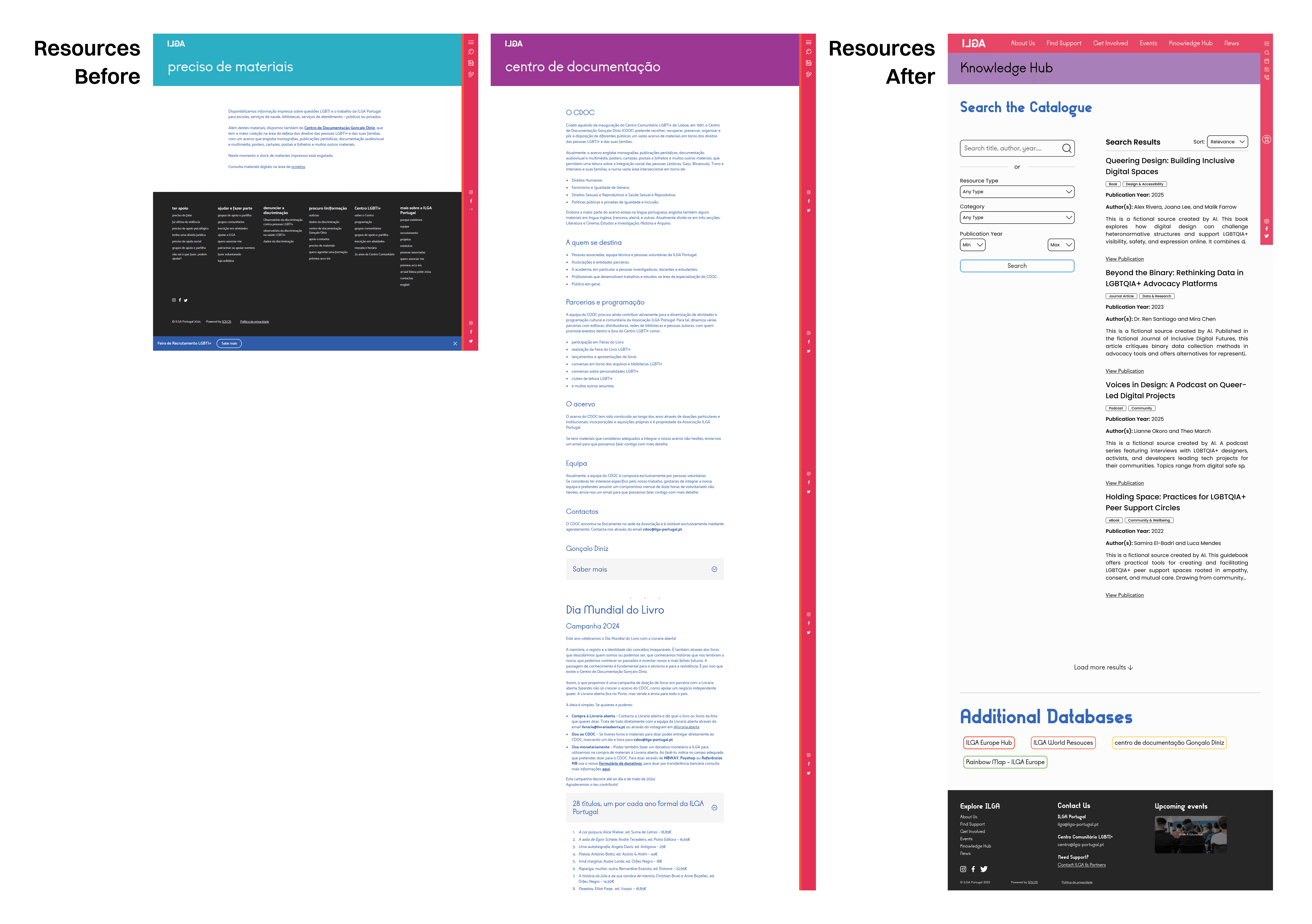
Redesigned ILGA Portugal resources section with a searchable database.

Solution

Five sections, built on user mental models

  • Homepage — communicates ILGA's mission and three pillars within seconds.
  • Events — a dedicated, intuitive hub for community gatherings and campaigns.
  • Knowledge Hub — one place for resources, research, and policy documents.
  • Get Involved — clear pathways for volunteering and advocacy.
  • Support — direct access to legal, mental-health, and community services.
  • Accessibility throughout — stronger contrast, larger action-oriented buttons, clearer type, plus dark-mode and font-resizing consideration.
In a second round of testing, 100% of participants completed every task independently — and recognized ILGA's mission the moment they arrived.
Second-round usability testing with the redesign
More projects Show all
Copied to clipboard