← Back to projects

UX Research & Product Design · WellNest · 2025

Designing for the part that comes after treatment.

A mobile experience supporting cancer survivors through the emotional, social, and mental-health challenges that surface once treatment ends and the medical system stops checking in. I led UX research, user interviews, and usability testing across the project.

WellNest mobile interface showing the community feed.
Industry
Healthtech
Year
2025
Role
UX/UI Design & User Research
Timeline
5 weeks · Part-time · Team project
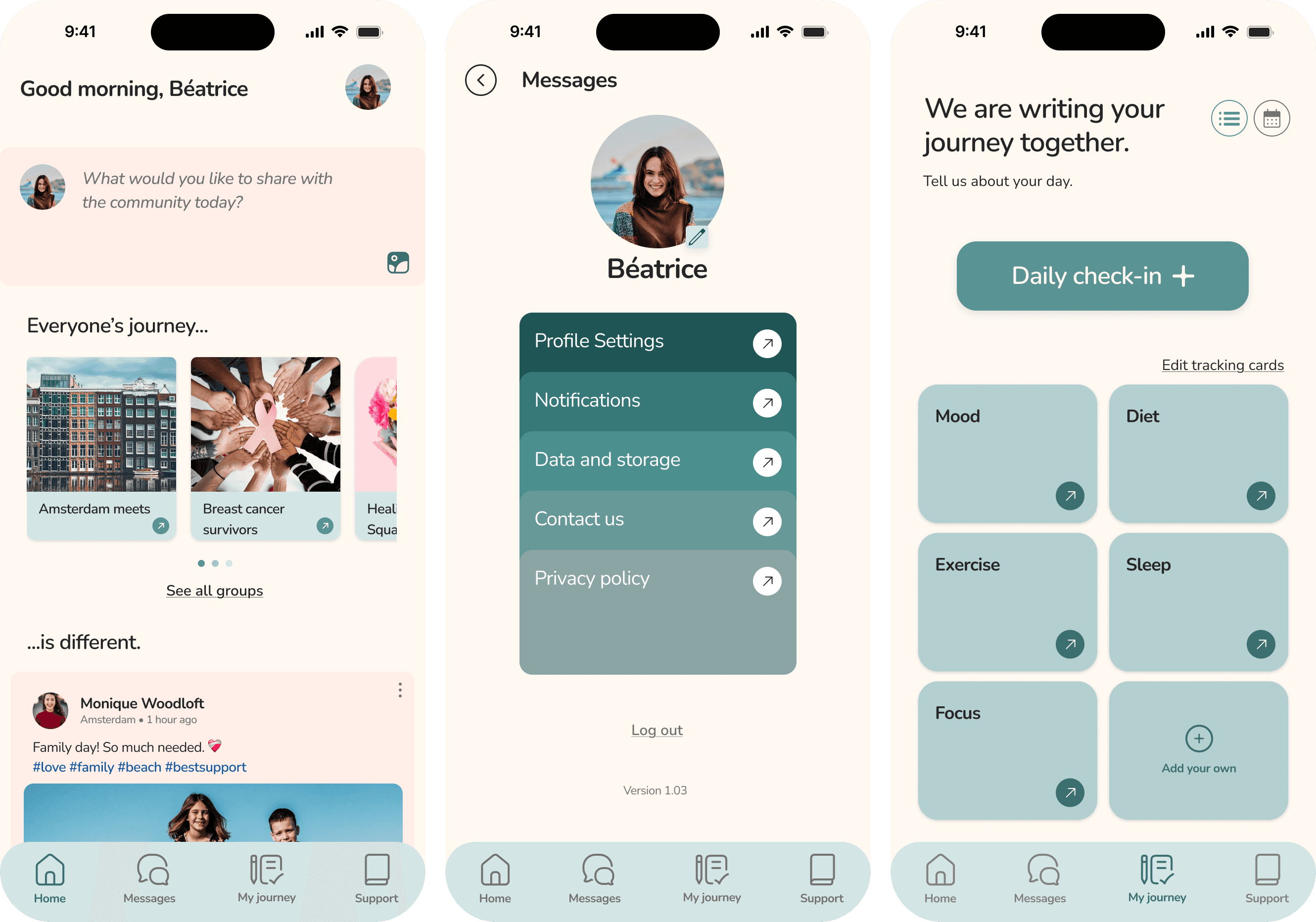
Three WellNest screens: home feed, profile settings, and daily check-in.

The problem

A steep emotional drop when treatment ends

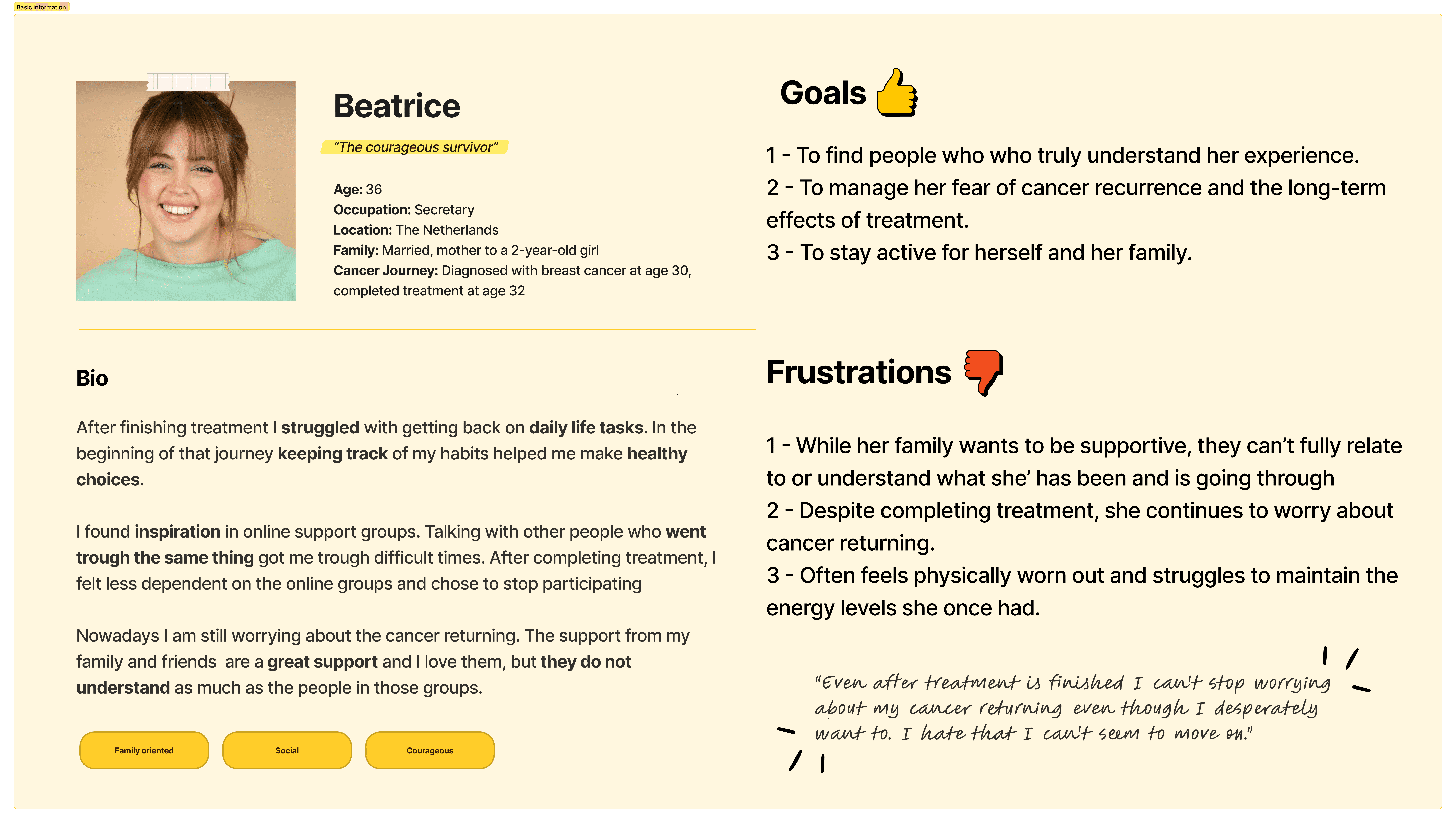
Survivors describe life after cancer as stepping out of a storm with no map for what comes next. Once the medical system stops checking in, they lose structured support, frequent contact, and the sense of belonging that came from the treatment community — many report feeling unsupported, isolated, or “left hanging.”

User persona card for Beatrice, a cancer survivor.

Research lead

Grounded in survivor voices

I took the lead on UX research, user interviews, and usability testing, and supported the team through concept development, user flows, and prototyping — keeping every decision grounded in empathy and evidence rather than assumption.

My family wants to take it all over for me, but they can't. The other girls understand. When you have to get another infusion or another operation, they know exactly what it feels like.
User interview participant
Cancer survivor · WellNest research
WellNest onboarding flow: welcome, create account, and notifications screens.WellNest onboarding personalization capturing the user's cancer journey.

Solution

Four needs, heard again and again

  • Emotional support — continuous and gentle, not clinical check-ins that stop when treatment does.
  • Community — connection with people who share the same lived experience.
  • Flexible coping — room for different coping styles, at each survivor's own pace.
  • Trust & safety — an environment built on emotional safety above all.
  • The problem statement — survivors need a way to connect with others who've shared their experience, because traditional support systems rarely address life after treatment.
WellNest moodboard exploring a calm, inclusive visual direction.

Direction

A calm, inclusive visual identity

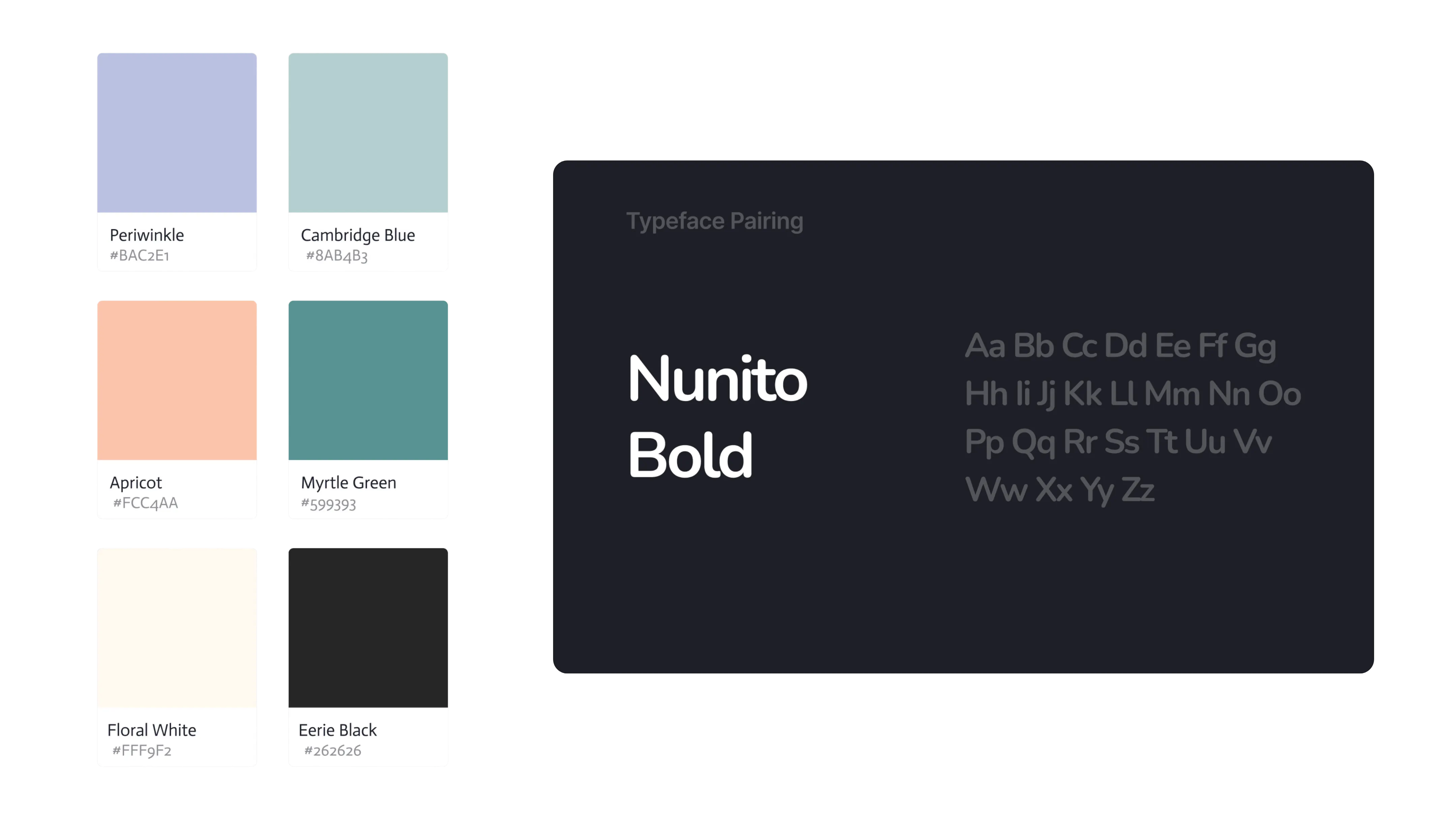
The visual identity leaned into calm, grounding tones and inclusive imagery — a deliberate step away from the clinical language survivors said they were tired of, toward something that felt safe and human.

WellNest color palette and typography set in Nunito Bold.

Process

Prioritised with purpose

We built the persona Beatrice, mapped her emotional journey, and used the MoSCoW method to focus on tools that guide without overwhelming. Low- and mid-fi prototypes were tested with survivors, leading to clearer onboarding and friendlier mood-tracking copy.

WellNest core support features: Messages, Articles, and Support screens.

What we built

Tools that guide without overwhelming

  • Identity-based groups — support spaces that actually feel like the survivor's own.
  • Private messaging — one-to-one connection with people who understand.
  • Daily check-ins — friendly mood tracking, reworded to feel human rather than clinical.
  • A reflection space — a personal, private place to process the emotional world.
  • Five core sections — an intentionally simple information architecture that keeps cognitive load low.
More projects Show all
Copied to clipboard