← Back to projects

UX Design & Information Architecture · SchoolsBuddy · 2025

Less time clicking, more time teaching.

A two-week solo redesign of the SchoolsBuddy teacher view — the school-management app I used daily in my own teaching — rebuilt for the real pace and chaos of a school day, especially managing after-school clubs.
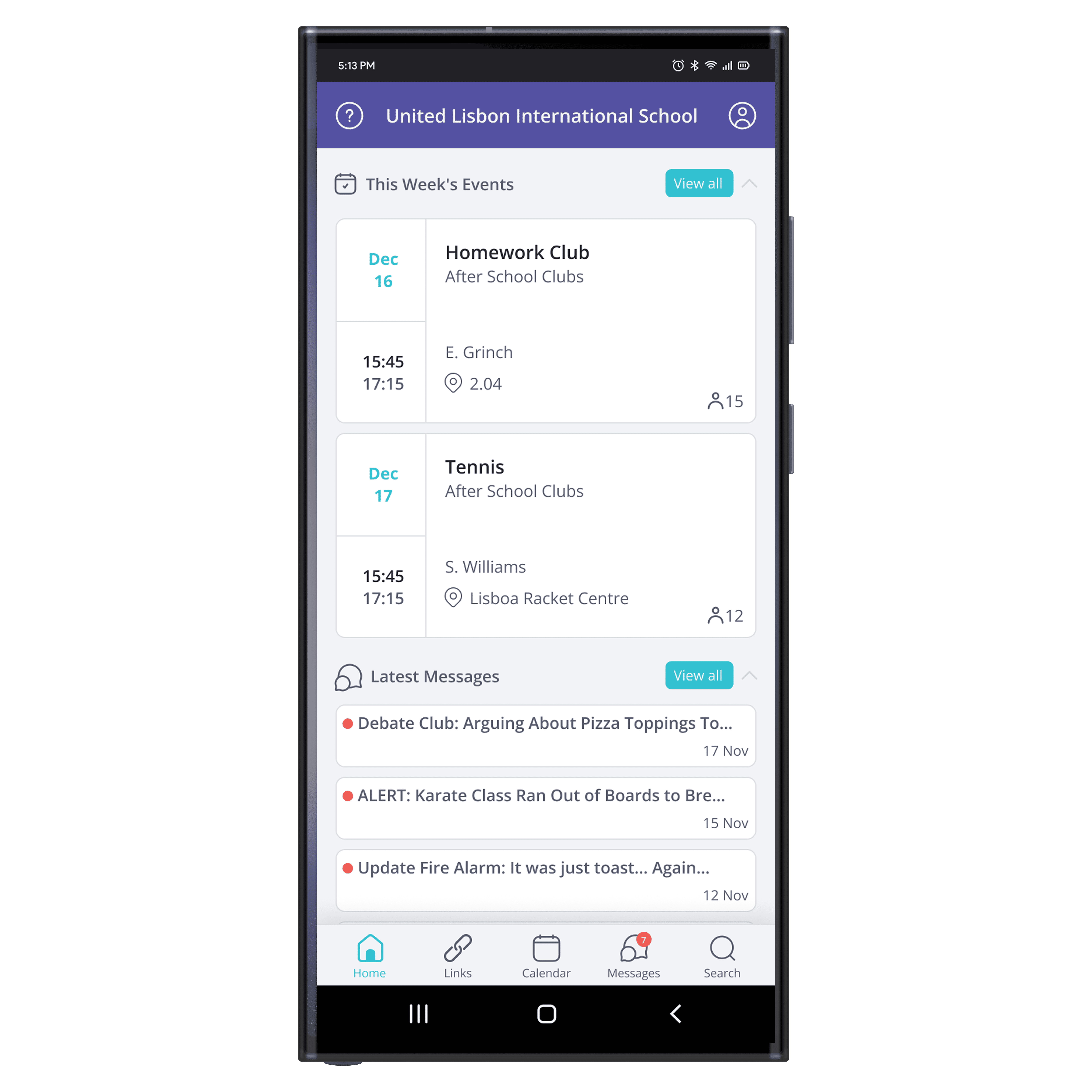
Redesigned SchoolsBuddy mobile teacher interface.
Industry
EdTech
Year
2025
Role
UX/UI Design & Information Architecture
Timeline
2 weeks · Part-time · Solo project
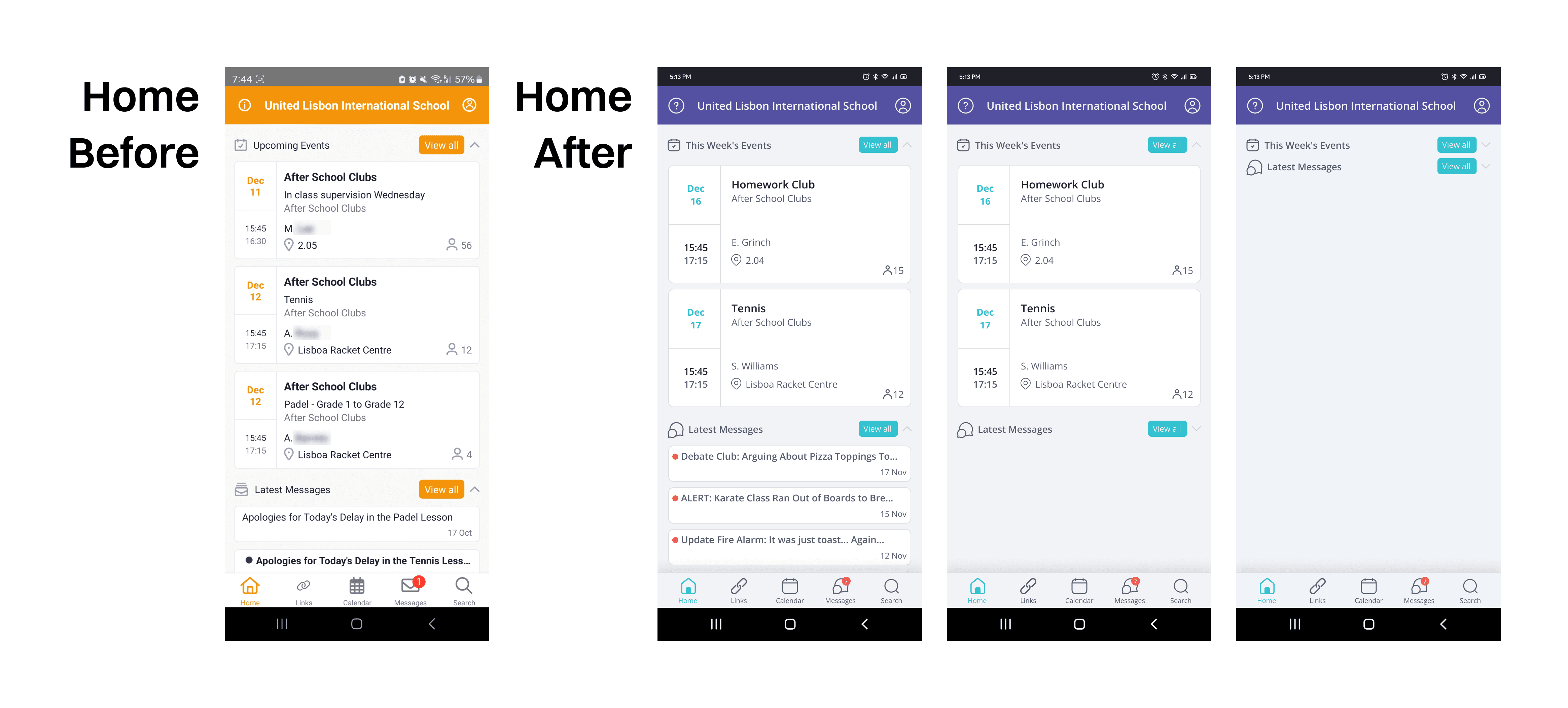
SchoolsBuddy home screen, before and after the redesign.

The context

Built by a daily user

As a teacher who used SchoolsBuddy every day, I felt first-hand that the teacher interface wasn't designed for the real pace of a school day. During my UX/UI bootcamp I took on the teacher view as a solo two-week challenge, leading the work from research through prototyping and visual design.

Competitor analysis of school-management apps.

Grounding

Heuristics, feedback, and competitors

I ran a heuristic evaluation against Nielsen's 10 usability heuristics, gathered feedback from teacher-colleagues who use the app daily, and studied competitors like EvolveGo, SOCS, and PikmyKid — which leaned on cleaner layouts, more thoughtful palettes, and simpler organization.

SchoolsBuddy calendar view, before and after the redesign.

Challenge

Cluttered, confusing, inefficient

  • Visual overload — a harsh palette with overly high contrast and no clear hierarchy.
  • Poor organization — illogically ordered lists, repetitive labels, and fragmented navigation.
  • Distracting loading animation — an over-the-top animation that made the app feel buggy.
  • Hidden help — the home-screen “info” button only showed a welcome message; real help was buried in settings.
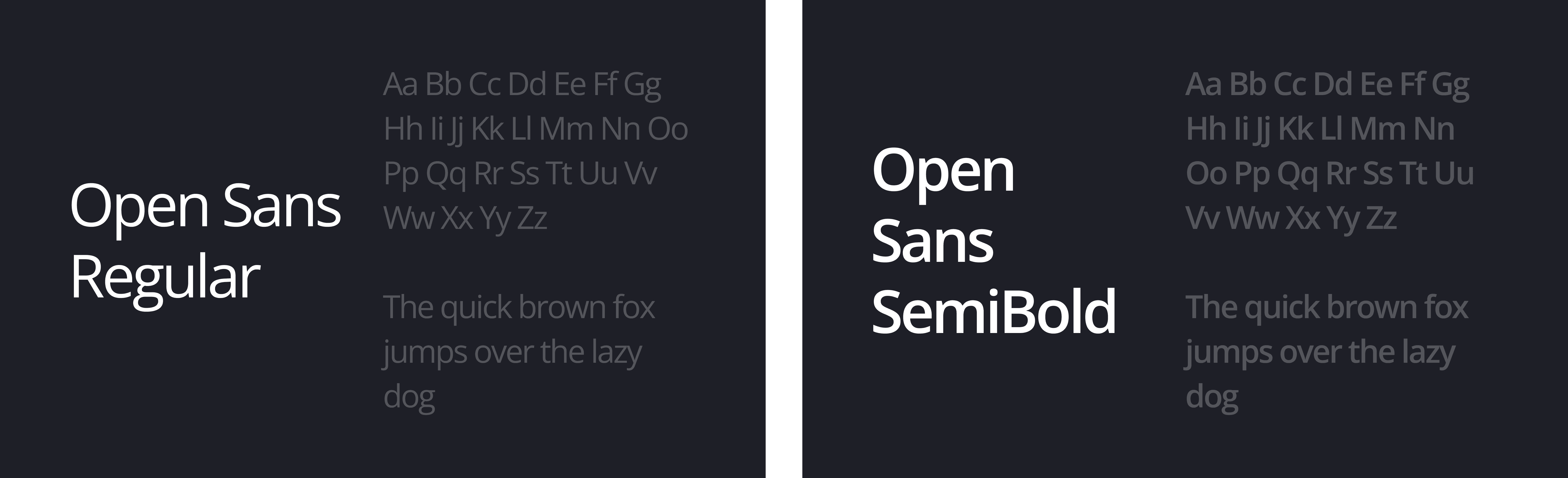
SchoolsBuddy color palette, before and after the redesign.SchoolsBuddy typography overview, set in Open Sans.

Solution

Calmer, clearer, more purposeful

  • Simplified color scheme — aligned to SchoolsBuddy's brand, with accents used only for clarity.
  • Restructured IA — a cleaner layout with logical ordering and clearer labels.
  • Smoother loading — a calm, intentional animation instead of a chaotic one.
  • Open Sans typography — better readability for teachers skimming quickly between tasks.
  • What teachers noticed — onboarding and navigation felt more intuitive, and the simpler palette reduced visual fatigue.
  • Looking back — I'd deepen accessibility next (higher contrast, larger tap targets, more padding) and rethink a few icons flagged as less intuitive.
More projects Show all
Copied to clipboard